B2B E-commerce Marketplace
A Salesforce-built spare-parts marketplace for a European railway giant, where standard e-commerce patterns broke at almost every turn.
- Salesforce
- Design Systems
- B2B
- Accessibility
Overview
Built on Salesforce for a European railway giant — complex enough that the platform itself became the primary design constraint.
- Role
- Product Designer
- Team
- 3 Designers · Developers · BAs · Project Manager
- Timeline
- 4 months
- 4
- Months
- 3
- Designers
- 40+
- Screens and states owned
Who I designed for
Buyers and procurement staff at railway operating companies placing bulk spare-parts orders, alongside the internal sales and operations teams managing the marketplace side.
Where I got stuck
Salesforce couldn't support search or filtering within bulk cart orders. Rather than fighting the constraint, I designed around it:
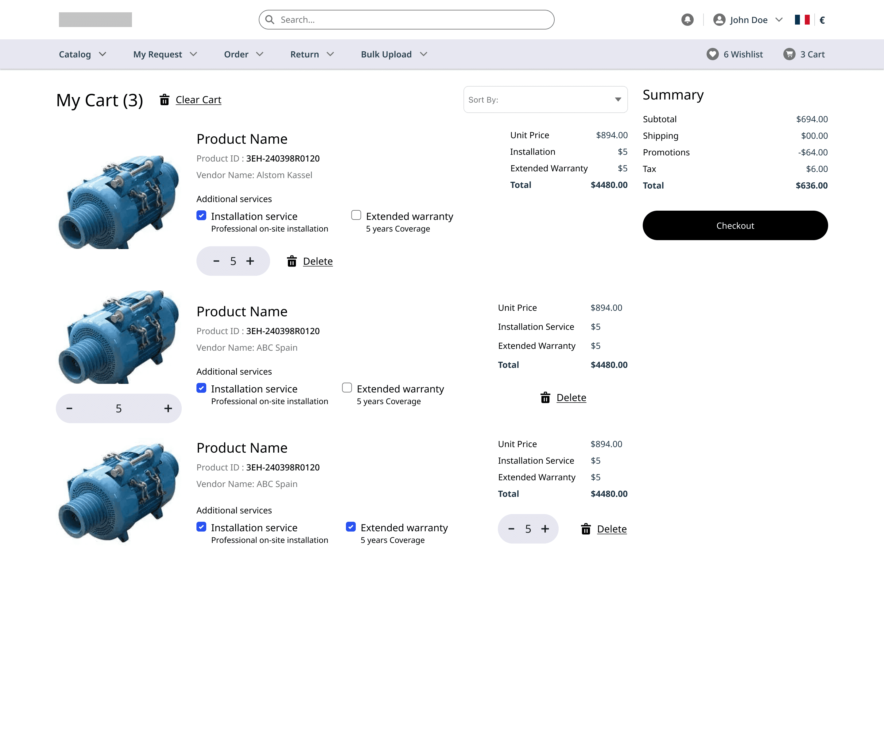
- Grouping orders clearly by seller
- Pagination instead of infinite scroll, so buyers aren't overwhelmed
- Semantic color to surface availability, pricing, and error states
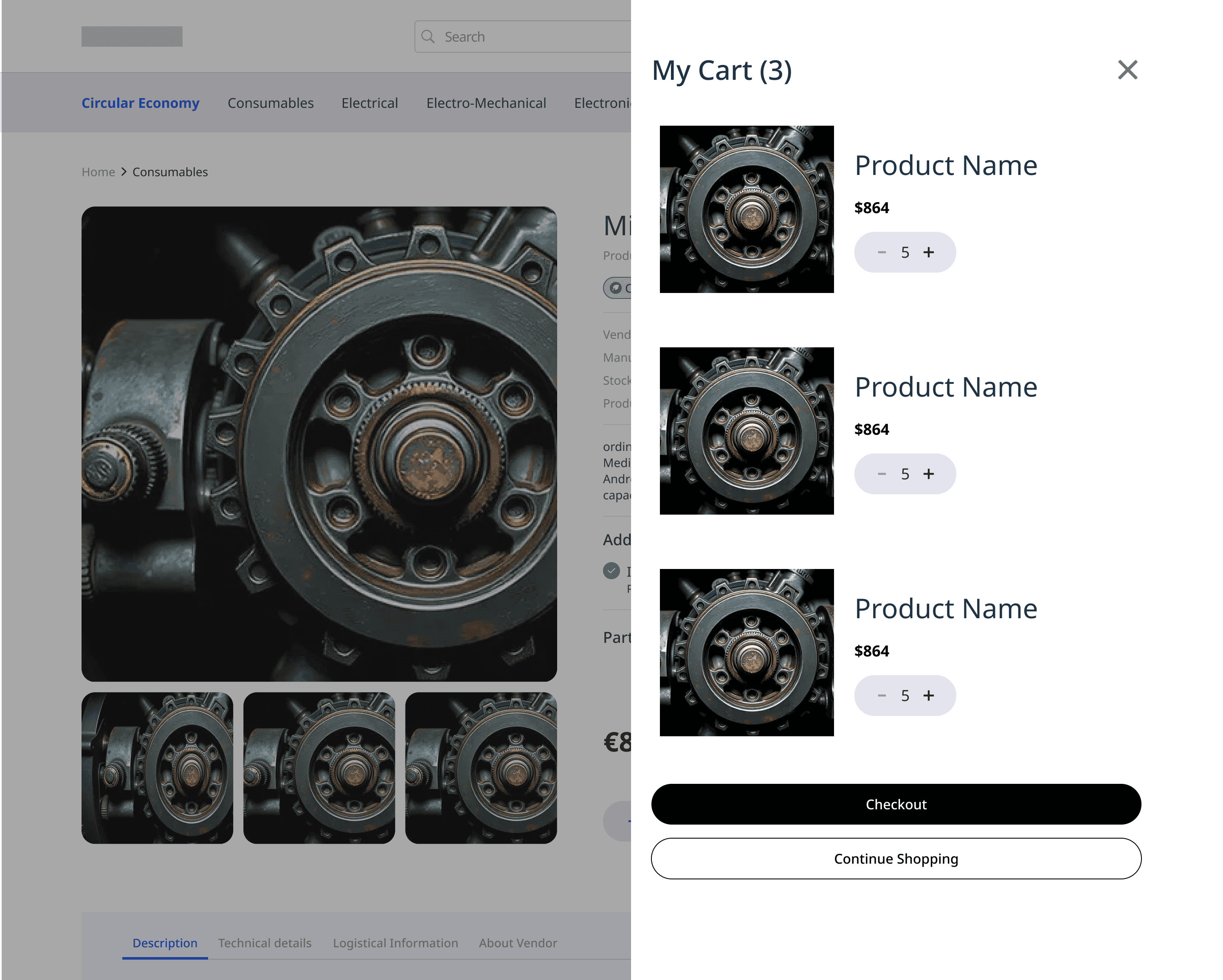
- A persistently visible cart summary throughout checkout
The constraint became a design decision.
How I worked
Rapid ideation and iterative design: thorough requirements gathering and user research, then detailed use cases defined for each interface.
From there I prioritised the essential tasks — product addition and checkout completion — and worked through a series of wireframes from low to high fidelity for the Product Listing, Product Detail, Cart, and Checkout pages.
Information architecture
Before any screen could be designed, the marketplace needed a structure. Catalogue and ordering sit at the top level, but the weight of the product lives inside My Account — contracts, quotations, saved carts, wishlists, and messaging, each with their own sub-levels.
What I built
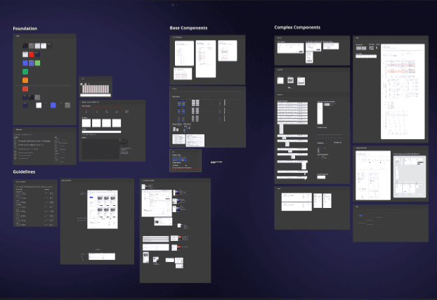
A full design system, built from what was originally just a brand palette. Color, type, component behavior, semantic rules, accessibility standards, and interaction states — defined from scratch.
I also took full ownership of the customer accounts flow — a flow spanning over 40 screens and states, with multiple verification steps and multi-account approvals, which meant navigating Salesforce's limitations to customise the process extensively.
- Intricate sub-flows for profile management, wishlist, cart, and organizational structures
- Multiple verification steps and multi-account approvals
- Profile, addresses, contracts, org management, saved carts, and invoices
Early Explorations
I used Figma Make to quickly iterate through UI directions — rapid wireframe exploration before settling on the final layout.
Business impact
Improved customer retention and engagement
Personalized account features — saved carts, wishlists, and streamlined profile management.
Enabled high-value B2B transactions
Efficient bulk order and cart management workflows.
Reduced friction in the checkout journey
Supporting higher conversion rates and improved purchase completion.
Accelerated development velocity
A scalable design system that also improved UI consistency and reduced long-term maintenance effort.
Increased customer satisfaction and repeat usage
Enhanced overall user experience and platform efficiency.
What I'd do differently
Understand Salesforce's technical constraints upfront. Time pressure meant workstreams ran in parallel, which caused avoidable rework and iteration.
Takeaways
Design around platform constraints instead of against them
Grouping, pagination, and persistent context can replace patterns a platform simply can't support.
A design system can be the most durable deliverable
Even on a project where most of the detailed work stays under NDA.
Further detail on this project is under NDA. What's shown here is process work only.
Still here?
If this is the kind of work you want on your team, let's talk.
I'm always up for a conversation about design, emerging tech, or building things that don't exist yet.
Currently in Bengaluru (IST) · open to remote-first roles, and to being somewhere else
See more work