Vela Health
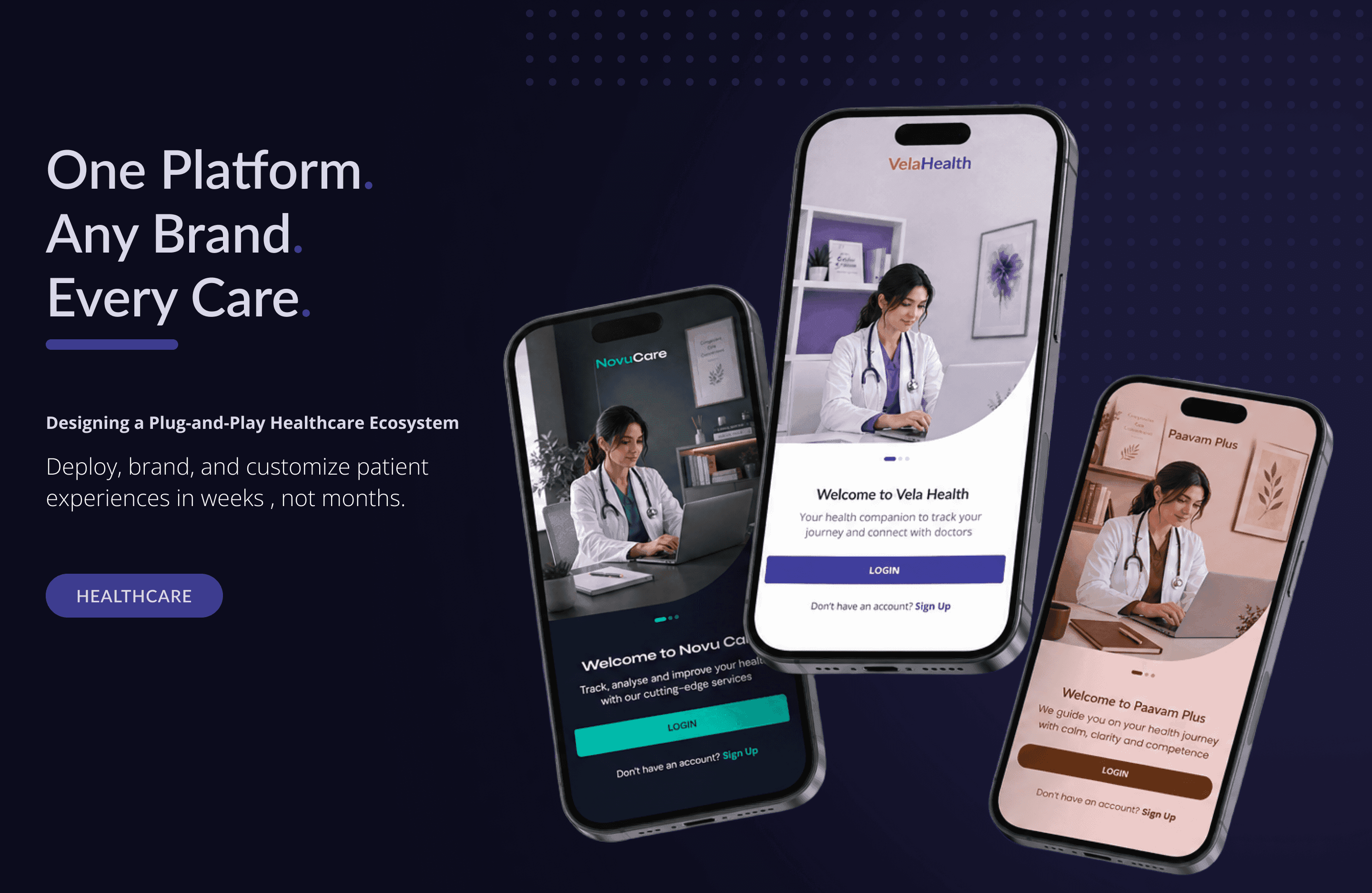
A single diabetes app rebuilt as a token-based platform any clinic can brand and launch as its own.
- Design Tokens
- MCP
- Platform Architecture
- Healthcare
- 0→1
- 1
- Platform
- 12
- Months to build
- 8
- Hours to MCP-ready
- 0
- Brands possible
- Role
- Product Designer
- Team
- 1 Product Owner · 1 UX Researcher · 1 Product Designer
- Timeline
- 2 months
Plug & Play
Ready to deploy
Brand & Customize
Make it yours
MCP-Native
Machine-readable handoff
Ship Faster
Go live in weeks
Problem
One diabetes app, unlimited brands
A diabetes-specific app, with no brief for how customization should work. It needed to become a disease-agnostic platform any clinic could re-skin and deploy, with brand changes handled as configuration instead of a rebuild for every client.
Research
Component forking doesn't scale past a handful of clients.
Before locking the architecture, I used Copilot to research how multi-tenant and white-label products structure theming, and the clearest finding was what doesn't work: forking a component per client breaks down fast, since every rebrand becomes a dev project and clinical logic drifts out of sync across forks. The system had to resolve at configuration time, not build time.
Design Principles
Build once, configure everywhere
One platform, unlimited brand configurations. Every new brand is a token change, not a pull request, and nothing client-specific ever forks into its own codebase.
Protect the logic layer
Primitive and semantic tokens can be overridden per client; the clinical logic and data structure beneath them never can, no matter how the surface looks.
Configuration over code
If a client-specific need can be solved with a token, it's not a development ticket. The system has to be legible enough that an engineer can configure a new brand on their own, without a screen-by-screen walkthrough.
The Architecture
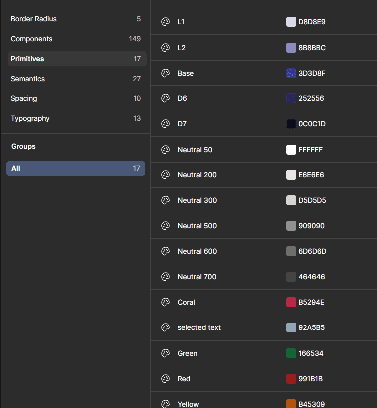
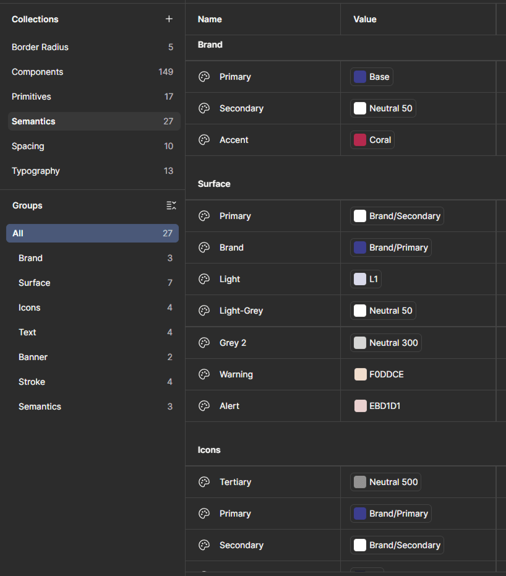
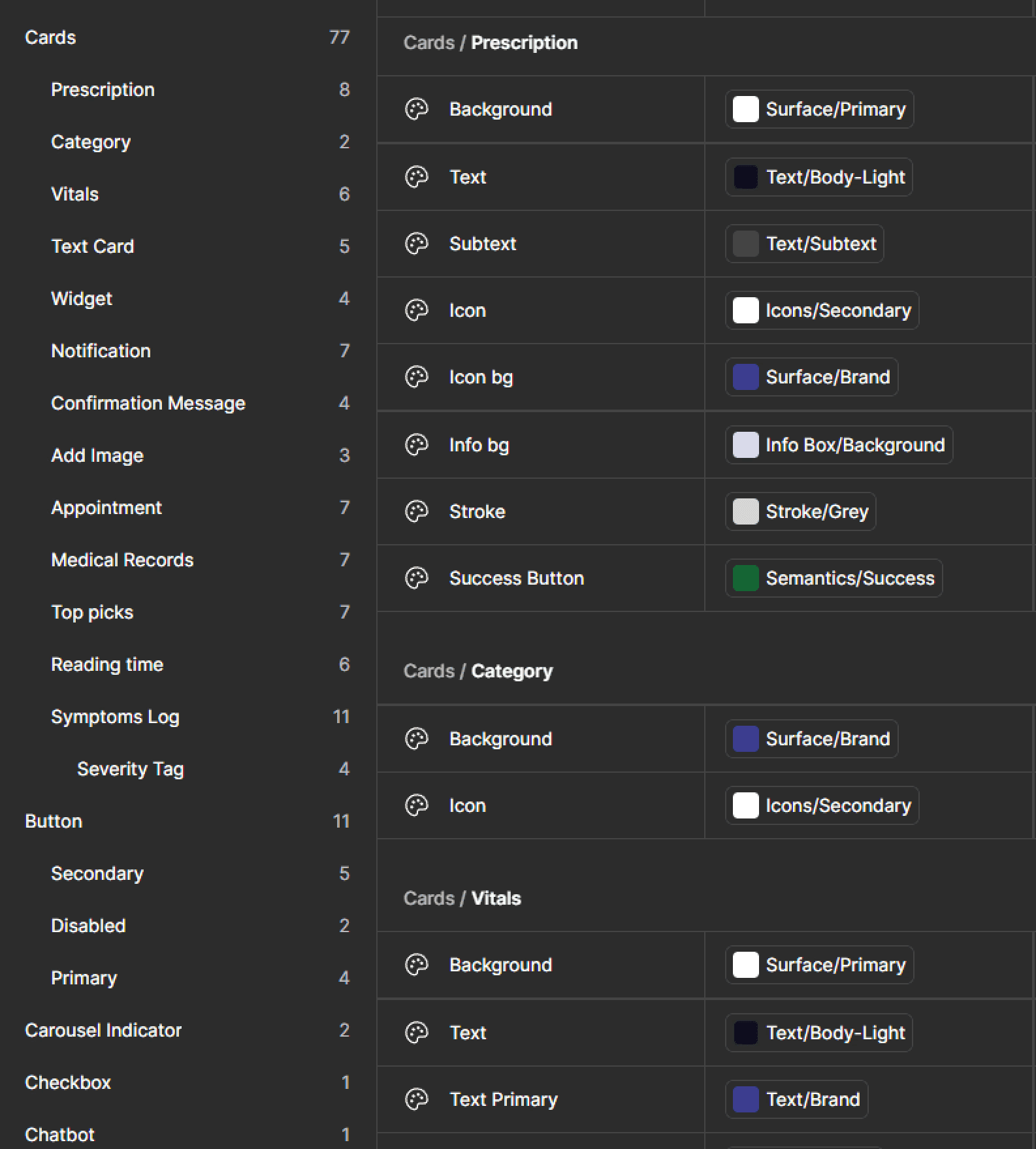
Not a component library. A three-tier token system.
Primitive tokens feed semantic tokens, which feed component tokens. Override the primitive layer with a new brand color or type scale, and every component downstream updates correctly, because nothing below the semantic layer is ever hardcoded.
Primitive → Semantic → Component
Switch the brand: only the row tied to Brand / Primary updates. Everything else stays put, because nothing below the semantic layer is ever hardcoded to a single client's palette.
Platform Architecture
The token system was only half the leverage. The other half was making it machine-readable.
A token architecture is only as fast as the handoff behind it. Every screen was named, componentized, and token-mapped to be MCP-friendly, so Figma's MCP server could expose accurate design context directly into engineers' own tools instead of redlines and screenshots.
to make 80+ existing screens MCP-ready
That retrofit (fixing naming, structure, and token application across the existing screen set) used to be a recurring cost every time the screen set changed. Once I could put Figma AI Agents on it, it became a one-time investment instead of a permanent tax on every design change.
Design in Figma
Screens and components built on the token system from the start.
Made MCP-ready
I used Figma AI Agents to retrofit naming, structure, and token application for machine-readability.
Pulled via MCP
Developers connect to the file's MCP server directly from their own tools, instead of manual redlining.
Shipped faster, more accurately
Fewer translation errors between design intent and implementation.
I used Figma Make for a similar kind of leverage earlier in the process: fast UI iteration, most visibly in the twenty severity-indicator explorations in the deep dive below.
Exploration
The Symptoms Log Flow
Problem statement
Symptom tracking didn't exist in the original product. This flow was designed from scratch, starting from one open question: what does a patient actually need to capture, and what does a clinician need to receive on the other end? Research surfaced four groups pulling on this feature from different directions: patients tracking a single chronic condition, patients managing several at once, caregivers coordinating care, and HCPs consuming the data downstream. Each opens the flow for a different reason, with a different definition of "done."
Brainstorming
Early research, before a single screen existed.
Why do we need this feature?
- Good for predictive/proactive healthcare: early detection, first stage awareness
- Flag red flags + warning signs
- Track progress of chronic illnesses or active diagnoses
- Help HCPs make more accurate diagnoses with detailed symptom logs + patient history
What do they gain at the end of it?
- A summarised symptom report to share with their HCP
- Patient report: simpler terminology, self-awareness, additional info
- HCP report: advanced pattern finding, medical terminology, diagnosis support
What are they using it for?
- Tracking progress + identifying patterns
- Becoming more self-aware and health-literate
- A better sense of how much, how long, and where
- A more accurate sense of their own pain and bodies
Why would they revisit?
- Easy knowledge transfer while switching HCPs or caregivers
- Tracking multiple diagnoses
- Chronic illness + recurring HCP visits
- Managing multiple HCPs
Who is using it?
- Primary: people with chronic illnesses, recurring conditions
- Secondary: caregivers, families of patients
- Tertiary: HCPs consuming logs and data for care optimisation
Wireframing the flow
The first build assumed one symptom per session: locate it on a body map, name it, rate its severity and duration, attach a photo, add notes, confirm. Twelve screens, one continuous decision. It made sense on paper, with clean steps and a clear ending, and it held up in early wireframes. It broke the moment we designed for the patients who actually needed this feature most: people logging more than one symptom at a time.
 1 / 12
 2 / 12
 3 / 12
 4 / 12
 5 / 12
 6 / 12
 7 / 12
 8 / 12
 9 / 12
 10 / 12
 11 / 12
 12 / 12
Scroll to see the full flow
Symptom severity selection: UI iterations
Severity needed to be quick to log and instantly legible, both to a patient mid-flare-up and to a clinician scanning a history later. That ruled out anything that needed a legend. Twenty explorations moved through bar charts, stacked lines, single accent marks, and an emotion-based scale, before converging on one continuous control: drag once, see the whole range.
What we tried for mild
One track explored an entirely different vocabulary: severity as a feeling, not a measurement, before we decided a clinical scale needed clinical language.
The final version
This version shipped as the foundation, not the finish line. The structural limitation got flagged explicitly rather than patched over, and a colleague took the research, the component system, and these screens to redesign the flow for multiple symptoms.
Solution
Three moments where the system shows up for the person using it, not just the brand selling it.
Intuitive dashboard
Tailored to each patient, built to surface what actually needs attention.
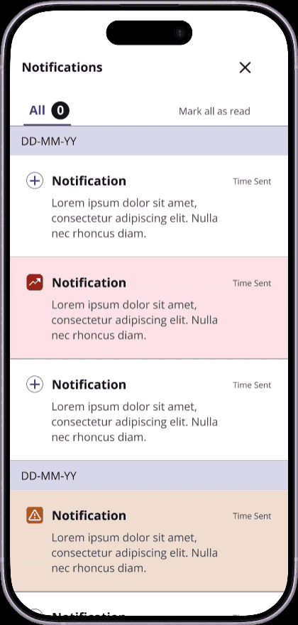
Clarity over confusion
Clear prioritization of what can't be delayed versus what can wait.
Track your trends
Synchronized data across the app, with trends and analysis across symptoms, vitals, and diagnoses.
Validation
What this proves, and what it doesn't yet.
Validated
- The four-user-type breakdown (patients managing one condition, patients managing several, caregivers, HCPs) came from real research into who actually opens this flow and why.
- The architectural limitation itself was validated through implementation: the single-symptom flow was actually built before the structural gap surfaced. That's a finding, not a hunch.
Not yet validated
No formal usability testing with real patients or clinicians happened on this build.
The lowest-common-denominator decision, designing for the least tech-literate user across three very different user types, was never validated with real users. That's the honest limitation of this work, and the first thing I'd do before shipping it wider.
Business Impact
One system, sold to every client without a bespoke build.
The token architecture isn't just a design pattern. It's the difference between a services business and a product business: a new client is a configuration exercise, not a development project. That's what makes a plug-and-play platform sellable at scale to hospitals and clinics that all want to look like themselves, not like Vela Health.
- Per-client deployment
- A configuration exercise, not a development project
- Time to market per client
- Days to weeks, not months
Reflection
Systems thinking over screen thinking
Building a token architecture that protected clinical logic while enabling unlimited brand customization taught me that the best design systems are invisible: they create freedom without creating chaos.
Finding the real problem mid-process
The symptom flow brief was simple. The real problem was structural, not visual. Identifying that a single-symptom flow couldn't serve chronic patients, and articulating why, was more valuable than any screen I designed.
Engineering leverage is a design decision too
The naming and structure discipline that made the token system clean was the same discipline that made it MCP-ready. That 'boring' hygiene work is what turned into an 8x speedup once I pointed Figma AI Agents at it. Leverage compounds when the underlying system is actually structured well.
Designing without user access
The lowest-common-denominator decision, designing for the least tech-literate user across three very different user types, was never validated with real users. That's the honest limitation of this work, and the first thing I'd fix.
Still here?
If this is the kind of work you want on your team, let's talk.
I'm always up for a conversation about design, emerging tech, or building things that don't exist yet.
Currently in Bengaluru (IST) · open to remote-first roles, and to being somewhere else
See more work